Family, friends and clients often ask me if I have a favorite paint color. As a designer, it is impossible to have one favorite color. There are so many fabulous colors out there, how could I possibly pick just ONE?? All said, I have been selecting paint colors for over 30 years and definitely have a few that qualify as my “tried and true”. These are colors that, selected with the whole scheme in mind, never fail me.
I have divided them into general categories and I happy to share them with you this month. For general advice on selecting paint colors, please check out my post “Selecting Paint Colors” on my blog, “Kim’s Pearls”.
Whites
Monterey White Benjamin Moore HC-27
This is a classic, warm white that I use on ceilings, walls and trim. It has a tiny touch of yellow in it, so it works well with warm color palettes.
Duron Shell White
This is my “go to” trim color. It is the perfect white for trim. Not too yellow, not too gray. It is a soft white that compliments any wall color. I often specify Shell White for walls below a chair rail in a foyer or dining room, especially if the walls have wainscoting. In a semi-gloss, the effect is classic and mimics panel molding.
*Note — Duron is now Sherwin Williams, but the formula for Shell White is still current and available. It can be mixed without a problem. Benjamin Moore will mix it as well.
Creamy White Benjamin Moore OC-7
I love this for walls, but often spec it for ceilings. It is a very warm white and has earned the title “creamy”. I also use it for trim when paired with a deep colored wall. Shell White can be a stark contrast for dark walls. Creamy white is softer and a better choice.
Neutrals
Manchester Tan Benjamin Moore HC-81
This is a warm, elegant color that is perfect for achieving a tone on tone look. I like to pair this with Shell White for a truly classic interior.
Edgecomb Gray Benjamin Moore HC-173
Best gray ever! This gray is very sophisticated, warm and goes with almost any color. It does not cast blue like many grays. We recently used this color to create an instant update to a 20-year kitchen. We painted the existing oak cabinets in Edgecomb Gray semi-gloss. It was quite a transformation! (See pictures on the “Salmon-Casson, Ltd. Luxury Townhouse Staging Project” post on “Kim’s Pearls”).
Ivoire Sherwin Williams 6127
This is a lovely “yellow” neutral. This is one of the prettiest colors I know. It looks like French vanilla and has a beautiful hue when the sun hits it.
Putnam Ivory Benjamin Moore HC-39
This neutral is one I use often for ceilings in small spaces, like powder rooms, or with texturized walls. It is strong enough to add contrast, but it does not overwhelm. It looks terrific with Shell White trim.
Softer Tan/Macademia Sherwin Williams 6141 & 6142
I paired these two colors together because I often specify them that way. I have used them in sync to create a flow of color for large areas such as open foyers/hallways or master suites. These two colors compliment natural stone, especially Creme Marfil.
Nantucket Gray Benjamin Moore HC-111
This is one of my new favorites! It reads as sage, but has more gray in it. It has a bit of a weathered feel to it, but I could see it both in a sophisticated setting or beach cottage. It is very soothing.
Hints
Pristine Benjamin Moore OC-75
This color is pretty, pretty, pretty! Pristine looks like white with a drop of peachy-pink in it. It has a lovely hue that changes with the light and compliments any complection. It also plays well with natural stone or marble. For these reasons, I use it in bedrooms or bathrooms.
Horizon Benjamin Moore 1478
This color is so subtle. It is white with a tint of grayish blue. It has an ethereal quality to it and works really well with a cooler palette. It is the perfect background for white cabinets and Carrera marble countertops.
Sea Salt Sherwin Williams 6204
Sea salt is the color you want when you are looking for a shade transitions from a green palette to a blue palette. It has a hint of both. To me, it is the perfect spa color and looks great in baths or exercise rooms.
Color
Mellowed Ivory Benjamin Moore 2149-50
This color reminds me of the froth from a well shaken Margarita! It is cool and crisp, but not sour. It has a mellow glow. I painted my basement office this color and it always feels light and refreshing.
Blonde Sherwin Williams 6128
Blonde is a deeper hue of Ivoire, and like many blondes, it can turn a head. Blonde is a perfect golden yellow. It is rich with warm umber undertones, which keep it from being too gold or “legal pad” yellow.
Wythe Blue Benjamin Moore HC-143
This color is a beautiful blue/green. It looks like a color from Colonial America that has stood the test of time and good taste. Like most classics, it can go traditional or modern. It looks terrific in dining rooms, kitchens and bathrooms. I love it with white or grey washed cabinets and black countertops. It is a winner.
Spicy Hue Sherwin Williams 6342
This energetic color has a kick! It is an orange with warmth and depth. I use it often for sunrooms, powder rooms or as an accent wall. Special note: it is a terrific background for abstract artwork.
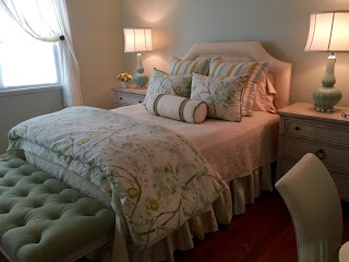
Filmy Green and Contented Sherwin Williams 6190 & 6191
I have listed these two colors together because I love them both and cannot choose a favorite! If you want a soft, serene color palette, either one of these will make you say, “ahhhh…, I am so glad to be home.” These colors are perfect for a bedroom. They work well with ivory, blue, green or soft pink. Think spa-like serenity and you will understand these two colors.
Lenox Tan Benjamin Moore HC-44
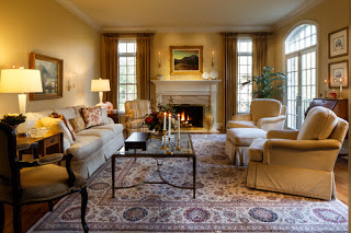
This color could also fall under the “Neutrals” heading, but for me, it has too much depth to be called neutral. Lenox Tan looks like coffee with cream in it. It is warm and embracing. It is masculine, but not too strong. I like to use it in gathering areas such as family and rec rooms, especially if there is a stone fireplace. Lenox Tan beautifully enhances the caramel and gray tones found in natural stone. I have also had success using it in boys’ rooms. In these cases, I painted three walls Lenox Tan and painted the fourth wall as an accent wall. Try Benjamin Moore Van Deusan HC-156 or Duron AC115N Tomatillo.
Blonde
Softer Tan
Ivoire